Designing for an online home rental platform
The most critical situation for a company can be expected at the time its users start abandoning the service they provide.
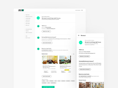
For a home rental platform, this case is when its tenant decides to move out of the house. So here my role as a product designer was to revamp their existing Moveout flow for the smooth offboarding of a tenant.
Designs are based on the following thoughts:
1. As the offboarding is a long process that has to be clearly understood and compulsorily followed by a tenant so I decided to break down the whole process into three major steps following the timeline fashion. The user moves ahead only when the previous step is completed.
2. As the reason for abandoning is still unclear so I started off by presenting them few helping options such as: Talk to our agent, Move to any of our other houses, etc.
3. Still, want to leave?
Let the user make an informed decision over how much amount they are going to lose in case they leave before the blocked time period.
4. The user is now anyway going to leave the house, so now least possible I could try to understand the reasons behind leaving us, this will help us to improve our service for the rest of our users.
5. Finally provided them with an option to opt for movers and packers at a discounted amount, that will simply help them in shifting.
6. A 'Cancel Moveout' button always sticks on the top in case the user changes his mind.
These are the few summarized points behind my design decisions.
I would be more than happy to know what's your take on this in the comments section.
Cheers!
Happy Designing :')


