Flight card detail
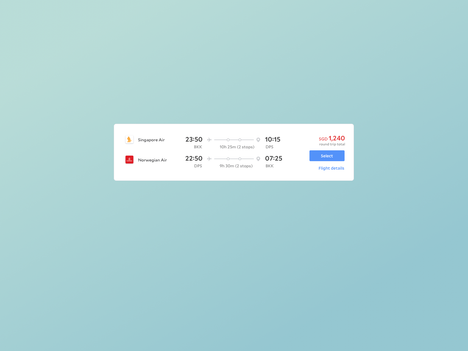
We tried a bunch of concepts that were careful in the way we brought focus to the important things – bright red for price (as was proven successful from hotel a/b tests), and reserving the boldest and biggest font weight for time related content.
Initially when we launched, the 'SELECT' button was nested within the flight details – we had the hypothesis that if we forced our users to review the details before giving them the ability to book, there would be less human errors in bookings. But the data we got back quickly disproved that – we saw that some users were going from search to checkout too fast, which meant they were probably not reviewing the details properly. We dug deeper and saw that these were repeats, so we deduced they were the ones who had already gone thru the process a few times and knew what they wanted, so us forcing them into this extra step was actually a point of friction. Based on this, we moved the 'SELECT' button to one level higher in our next iteration.
Read about the process here
You can see our live product (and maybe book a flight while you're at it) here: https://www.agoda.com/flights