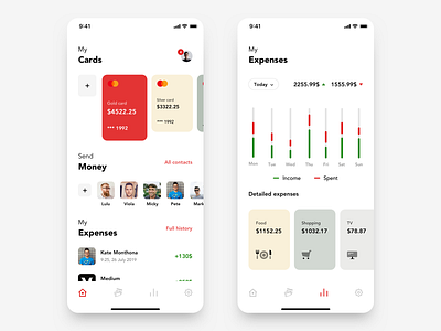
Santander App redesign concept- Dashboard and Expenses
Hello Dribbble!
Today I want to show you two most important views in whole application- dashboard and expenses.
What in my opinion is obligatory to show in dashboard? Easy preview of accounts and switching between them, possibility to send money and quickly preview of last transaction. I am happy that I could fit it on my dashboard and still it looks clean.
I decided to divide expenses on two parts. Chart when user can take a look at proportion of incomes and spents and also detailed expenses when user can see it divided on categories. There is also possibility to choose period of time for this informations.
More by Bartek Gadzina View profile
Like


