Blog
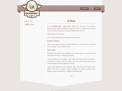
Did a redesign of my blog around Mar/Apr this year. It is powered by Jekyll, normalize.css and Susy grid system.
The glass cover of branding on top-left actually opens up using css3 3d transforms and transition. You can have a look at a recorded demo - http://www.youtube.com/watch?v=0YA1mTq4pTY (pardon the lousy music in background)
I'll be doing more work on the typography - quotes, bullets, headings in my next iteration. I also find the line-height to be slightly more than appropriate.
The sidebar on left is mostly empty vertically. Would it be good to get rid of that and have date, tags information at start or end of the posts?
Besides, on the lines of 'text as interface', I'm thinking of representing tags as '#inspiration #foo #etc'.
More by Abhishek Mishra View profile
Like


