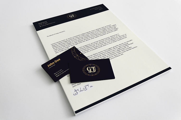
George Thomas Corporate Identity Design
New CI concept for one of our company's clients.
I redesigned the logo with their speciality in lighting in mind, as depicted by the swirl of the G ending in a vintage variant of a light bulb symbol. I wanted to keep minimalism in mind, but with a more vintage touch and a darker theme. This was the challenge I set for myself.
More by Beryl Pretorius View profile
Like
