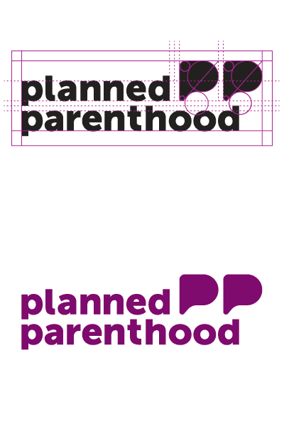
Planned Parenthood Logo (Final)
So after much going back and forth, this is the final mark I developed for Planned Parenthood. Underwhelming and safe, to be sure, but it makes the most real-world sense. The type is a slight mod off Museo Sans. It's basically just cutting the ascenders and descenders and manually kerning to make the whole lockup make sense.
The two P's double as quotation marks and speech bubbles as my whole goal in rebranding the organization was about putting mature discussion about sensitive topics in a safe place as its core mission.
Also have you guys seen the new Planned Parenthood logo they unveiled last week to absolutely zero fanfare? Idk about you but their new logo reeks a little of my previous iterations... makes me glad I didn't stick to my elephants now. And of course a tiny part of me still would have liked to see how things would have turned out if I used the uterus/penis combo logo.
