Amoha - V1
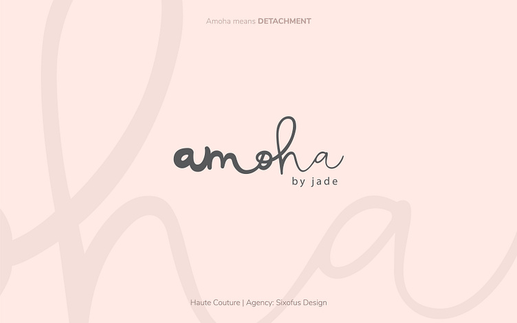
Concept#1 for Amoha - a subbrand of Jade, a High-profile ready to wear pret line of clothing.
Amoha means Detachment. The alphabets in the logo loose their weight from left to right, denoting shedding the excess - a form of detachment. The use of hand lettering with unequal spacing between each alphabet further strengthens the feeling.
This was designed in 2017, during my time at Sixofus Design.
More by Prashant Golani View profile
Like
