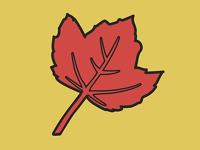
Autumnal Leaf Bold
In a similar manner to the turkey, I had to make the leaves (from an earlier shot) more bold for newsprint-style usage. This better reflects how all the thanksgiving iconography ended up, with simple shapes and bold outlines. I'll post how the turkey looks in this style tomorrow. I have to say, for seasonal work (which can sometimes seem like treading over well-worn ground) I am really pleased with the design direction this series has taken.
More by Brandon Leedy View profile
Like
