Costers del Priorat
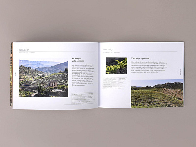
Redesign of the catalogue, brochures and wine info sheets for Costers del Priorat winery. We have tried to maintain the sober and elegant style of the brand but restructuring and giving a more modern editorial design. The use of typographies with more personality and a different structure of the content make it much more interesting and dynamic.
For the catalogue, we have printed on different papers that provide a variety of textures to the catalogue, also playing with photographs as the main element. In addition, several dies were made that make it even more interesting. The informative diptychs have a vertical format of opening upwards, and both in these and in the technical cards of the wines, the central crease has been displaced, so that the photographs are also played with allowing part of the interiors to be glimpsed on the main face. More info
http://botanicoestudio.com/portfolio/costers-del-priorat/
