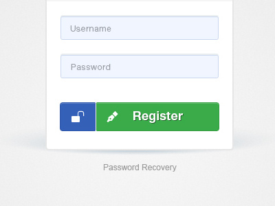
log-in Panel
Yet another login panel. I took some time and re-design the old one with blue. The reason was, I am becoming tired of using gradients, the problems they produce (banding) and the way they look. This whole 3d/slick/silky look is overused and kind of repetitive. I wanted a whole new approach & focus on the what rather than on the how.
More by Sorin Jurcut View profile
Like
