Project #24
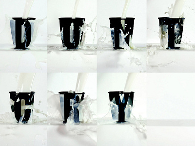
What I love most is pushing the lines of legibility and seeing what the viewer is able to understand with as minimal information as possible. Inspired by a waterfall I saw in Japan, I wanted to create typography that is revealed from this energetic motion. Each letter of the alphabet was hand-cut from individual black cups and placed on a white table in front of a white background. I then poured milk into the cups to reveal each of the letters. From there I used the photos to spell out the idiomatic expression "Don't cry over spilt milk."
Check out the full alphabet here: http://DaydreamsandNightschemes.com/Project-24