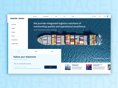
Redesign Kuehne+Nagel Website.
Redesign of the website of Kuehne+Nagel. The website has a lot of information direct above the fold. I've tried to make it clearer by organizing several elements like the navigation bar. Also placed a 'placeholder' in the input field of the tracking reference. This helps te user to prevent making mistakes because it reduces cognitive load.
More by Tai Tang View profile
Like
