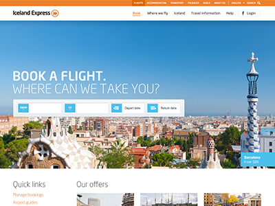
Airline Website
I was designing a new site for an airline a while back. Just as we finished the first round of the home page design, the airline was bought, the company merged into another and the project thereby permanently shelved.
It was going to be a responsive design with a sticky navigation and all the other buzzwords. Shame we couldn't see this one through, I think it was a promising start.
Attached are three versions of the home page, the only difference being the main image. The one with Park Güell in Barcelona is my favourite - see here
I worked on this with my good friends from Iceland at www.takktakk.is
More by ueno. View profile
Like


