Interactive Healthcare Data Table
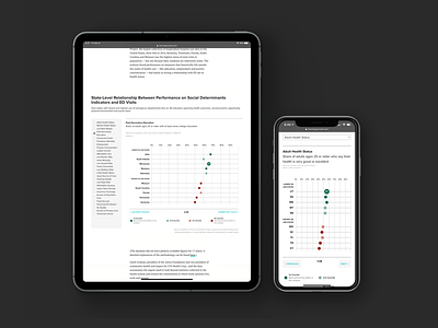

What you do when you have a heavy Excel sheet of data gathered from 10 states across 28 topics to show patterns and make it easier to digest?
I've worked on this interactive data sheet that shows just that. To fully understand the data, the article explains the correlation and the importance of it all in the healthcare data Morning Consult have presented here.
Snippet from the posted article:
"A Morning Consult analysis of the relationship between emergency department visits at the state level and 28 indicators of the determinants reveals a strong relationship between ED use and markers of education, employment and mental health in states with the highest and lowest use of emergency care."
To see the interactive chart and the live article:
https://morningconsult.com/2019/11/07/in-the-emergency-room-patients-unmet-social-needs-and-health-needs-converge/