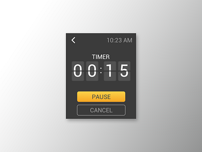
Daily UI 14 - Timer
For this challenge, I wanted to give the interface a bit of dimension. When I created it, I had an analog flip board concept in my head. I wanted to give things a bit of dimension by adding a subtle inner shadow for the numbers as well as a gradient for the pause button. I used Sketch for the UI design and Photoshop for the mockup.
Hit "L" on your keyboard to show some love. If you like what you see, please consider hitting the follow button. As always, thanks for the support!
More by Jimmy Diep View profile
Like

