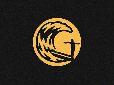
Surf
Fun little mark that didn't make the cut. The name that was to be associated with the graphic began with the letter G, hence the hidden G formed by the relationship between the surfer and the wave.
I'm growing more convinced every day that the best way to doom a design to client rejection is to grow attached to it. It's like in the movies... as soon as you feel that you're being drawn to a certain character, you can be sure that the writers are about to kill them off. Alas, I share here.
More by Yondr Studio View profile
Like
