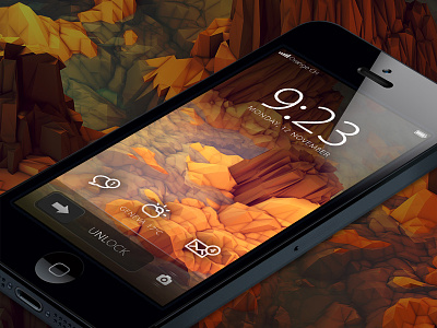
Revisited iPhone home screen
Knowing that Sir Jonathan Ive will be in charge for all human interfaces is a real joy for me.
I tried to imagine what the home screen of the iPhone could look like in a minimalistic feel.
I kept it almost intact, just tried to "Ive-it" a little, so no awesome new functions, just a visual improvement.
See the attachments for a a bigger view.
I used Myriad and Myriad light for the texts, Adam Whitcroft's Climaicons and Timothy J. Reynolds' awesome wallpaper for the background.
It's just the beginning of a concept to play with pixels on my spare time, so don't be to rude on n UX point of view.
What's your feeling about this? :-)
More by Loris Grillet View profile
Like


