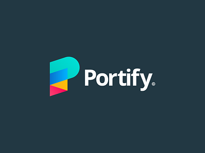
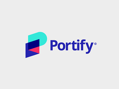
Portify Logo V3 - Final Design
Hey Dribbblers,
I'm finally able to show the final iteration of the Portify identity. After going back and forth with the client we decided to adjust the fold on the 'P' and the colours to be more fitting with the brand.
Overall I'm pretty pleased by how this turned out and although it's a mad mix of colours they start to grow on you over time.
I'd love to know your thoughts.
Font used is Franklin Gothic URW
Check out more work here:
Behance | Instagram | Download
More by Alex Aperios View profile
Like


