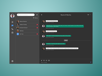
Direct Messaging - Daily UI 13
For this challenge, the topic was direct messaging. I decided to create a UI for a collaboration app like Slack or Webex teams. I kept in mind that the user will want to have direct, point-to-point interactions as well as the ability to create group channels or rooms. I thought that having a favorites feature will help the user view their most important conversations faster. I used a dark UI since the user will be reading a lot of text. Dark themes tend to work well and help with eye strain when there is a lot of reading involved.
Thanks for viewing and hit the like button if you are enjoying this shot! If you want to see more posts like this, please consider following. Much love!
More by Jimmy Diep View profile
Like
