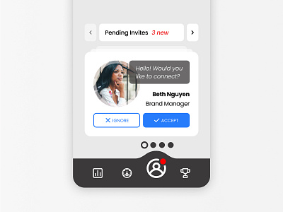
Daily UI #078 - Pending Invitation
Thoughts
For today I wanted to focus on creating a solid mockup with good UX design.
This mockup shows a visual slice of an app with friends/social functionality, highlight pending friend invites.
Notes on Functionality:
- Accepting the request gives the card a slight bouncing animation and slides out to the right. If the request is ignored, it will quickly disappear to the left and reveal the next invite in the stack.
- The speech bubble could be customized by the sender, by there is a strict limit on the number of characters allowed.
- Each icon on the lower navigation bar would expand upwards “pushing” the boundaries of the bar, creating a visual bump. Here we are on the “Social” tab.
- The 4 dots represent 4 sets of cards, the outlined dot indicates which set the user is on. They can navigate through these 4 sets with the arrows, or by swiping or gesturing right and left. In this mockup, the user is on the first set which is “pending friend invites”.
- The name and job title would be anchored to the right margin and would expand to the left overlapping the profile photo if needed.
The profile photo is by Matthew Henry from Burst.
Thanks for checking out my post!
-- -- --
Press “L” to like my shot and to keep me motivated to make it to the end! Feel free to leave any feedback as well, all words are welcome. 😋👍
-- -- --
The Challenge is to complete one unique User Interface design task every day, for 100 days. You can read more about it here: https://www.dailyui.co/
