Property Management
Designed and built a mobile app for listing a property.
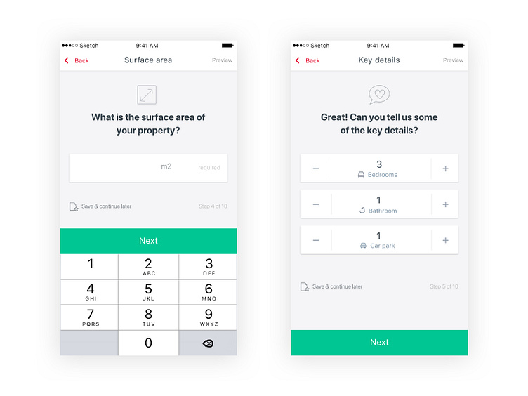
We seperated out the form to have minimal, similar actions on each screen so the user could advance through the flow more efficently.
Used mobile prime interactions like tap and go instead of a submit button, numeric keyboard for number inputs on the left.
On the right, we defaulted to median numbers in a particular city or suburb for that particular property type (set in previous screens) which reduced the likelihood of the user needing to change the key details. Most users only needed to interact with the screen on the right once or two max.
The entire flow was 9 screens and majority of users were able to advance more than halfway in less than a minute.
More by Sam Weller View profile
Like
