La Croix Sparkling Water—Lemon
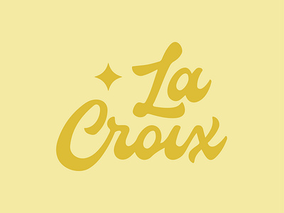
As I start a November Daily Design Challenge, I decided to tackle something that I have been wanting to do for a while—redesign La Croix's logo.
While showcasing the spirit of the vivacious Sparkling Water brand was important, I also wanted to make sure that the logo clearly stemmed from its predecessor with the choice of the sparkling and bold script type that makes up "La Croix."
The "sparkle" that sits to the left in the logo is meant to symbolize the feeling of when La Croix hits your tastebuds.
More by Studio David View profile
Like
