LightningSeven
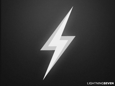
A logomark design, incorporating the initials of the (fake) company into lightning bolt.
Going grayscale for now, partly because it helps me 'develop the brand', partly because I can't be bothered to come up with a decent colour scheme :)
More by Conor O'Driscoll View profile
Like
