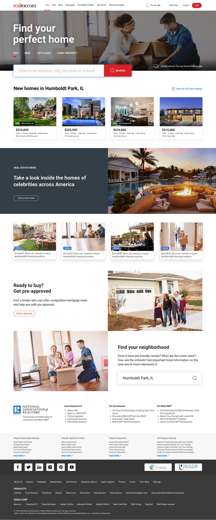
Home Page Clean Up
We wanted to modernize our home page, redefine the key messaging and make it easier for a new user to get started.
We focused on introducing more white space, refining our type styles and making search the hero. In addition, replacing the hero image of a house with something depicting the *people* who live in houses.
We also wanted to provide more options to "pick up where you left off" and find homes without having to search. Finally, the decision to move all content from being center aligned and defaulting to left-align for easier readability.
Lastly, by defaulting to the search input being in focus reduces an additional tap but also with the blue shadow reinforce our commitment of accessibility.
More by Sam Weller View profile
Like
