Registration Form
Here is a design solution based on a UX heuristic analysis (and research) regarding a registration form of a company operating in the betting industry.
(Some) Findings/Recommendation:
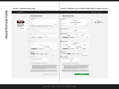
Make the form as short as possible, grouping the fields in a maximum of 3 steps. Give a title to each step, to inform the user about the content and get him prepared. EX: 1- login details, 2- personal and contact details, 3- and so on.
I designed a single-page registration form to reduce user’s clicks, and let the user have a panoramic view of what is going to happen shortly.
Engage the user offering rewards (welcome bonus), to motivate the user to complete the registration form.
Use floating labels or align the label text on the top left part of the field, to save space on the page and make instructions always visible.
Write below the password field all the must-have characteristics the password needs to have to be correct. Write in clear words which is the error and how the user can avoid it.
Make the visibility icon change status when the user interacts with it (click on it) to show or hide the password typed.
Avoid using a confirm password field. A best practice is to use a visibility icon or an information text to let the user show or hide the password he is writing. Moreover, the registration process is faster.
Keep the help button/ live chat icon visible. User may need at any time to access very quickly.
Let the user choose between more than one security question.
Avoid distractions for the user, focus the design on the user flow and user goal.