Betting affiliate website - Quick UX UI improvements
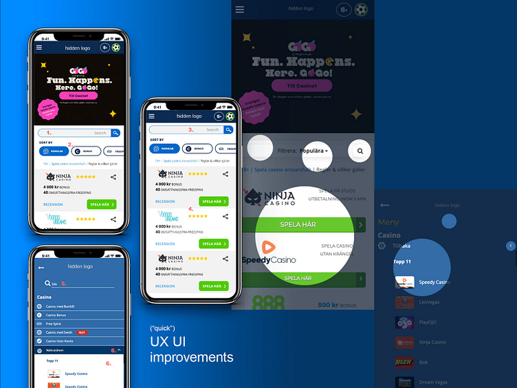
Hello! Here is a summary of an exercise I did some time ago. Find the main pain points and suggest UX UI improvements about this (top secret!) affiliate website homepage. The spots highlighted are the pain points where I made changes. Quick suggestions/Changes: 1. Split up the Dropdown filter menu and Search element, for better use of each functionality. 2. Dropdown filter menu replaced by a set of "choice chips" showing filter types. They are horizontally scrollable. 3. Cards layout modified: "Share" functionality added, "Recension" CTA added (direct access to important info), usage of two different background colours to make content easily scannable (background as a divider). 4. Search, and filters menu are sticky while scrolling vertically. 5. Search functionality added on the top part of the hamburger menu. 6. Hamburger menu and submenu: different background colours to identify each context areas making content easily scannable.