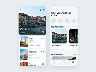
Travel App Design Concept
We can't imagine life without traveling. Can you? Our latest design is for an app that helps to discover interesting tourist spots. If you’ve ever wanted to enhance the travel industry (or you’re always eager to travel), check this out! A few details: 🌏 To prevent users from visiting separate category pages, we’ve decided to organize content using horizontal scrolling. 🌴 Light-colored background is superb for content-driven interfaces. In this case, it definitely does the trick and helps the user focus primarily on breath-taking spots and views.
Press 👍if you like it and say Where do you find travel inspiration? Instagram bloggers? Other people? Maybe Pinterest?
Created by Julia Sanyuk
The team is available for new projects! Drop us a line: hello@purrweb.com | WhatsApp
PS We know to utilize UI/UX design to make users fall in love with a product. Check out how we used our skills to: - raise $400k as capital for startup - streamline cryptocurrency e-wallet - reboot a Real Estate startup - help newbies jump into investing - conquer the chef freelance market - simplify the life of event organizers And that's not all — you can find more case studies in our Blog! 💜
Join us on: Website | Instagram | Medium | Behance | Facebook

