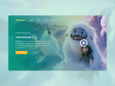
Redesign Landing Pace Cinema
Hi guys,
When booking tickets some time ago, I feel a current site was less attractive to visitors. The majority of visitors want to use it because it's a single service (assuming). Therefore, in this post I am trying to make exploration design about cinema booking with concept clean, modern and fun. So, that can attract visitor many more
More screen can you see in : https://www.behance.net/gallery/86448681/Landing-Page-Cinema
Hope you like it guys and very happy to hear your feedback : )
----------------------------------------------
Interested to work together? you can contact adit.anugrahp@gmail.com for further discussion
More by Aditya Anugrah View profile
Like
