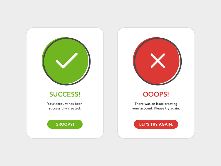
Flash Message - Daily UI 11
For this challenge, I wanted the branding to have an illustrative look to it. So far, everything I've done for the challenges has been flat and uniform. I wanted things to be a bit offset to create that "imperfect" illustrative style. I wanted it to be fun without going overboard and keeping things recognizable. Hit "L" on your keyboard if you like what you see. If you want to see the rest of my Daily UI challenge submissions, be sure to follow so you don't miss future posts! As always, much love to everyone for the support.
More by Jimmy Diep View profile
Like
