NPath Logo Concept
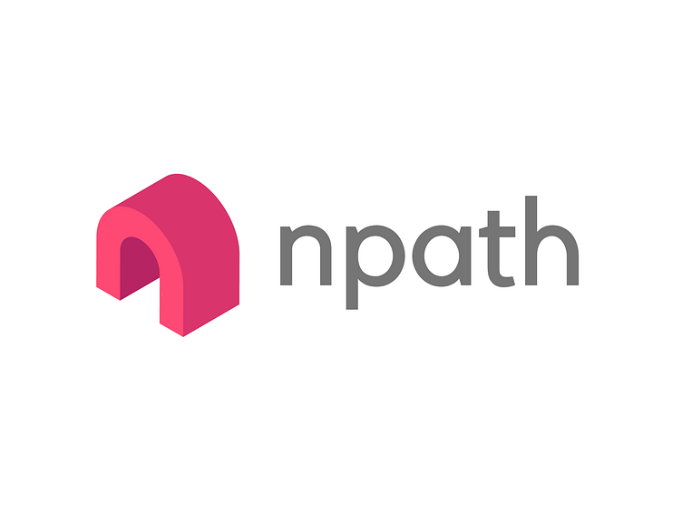
Isometric ‘n’ + entrance = npath
Design Process ~ I had a lot of fun making this logo as the process took me three days. The logomark was originally non-isometric or flattened. I drafted roughly 40 lowercase ‘n’ logomark then picked the flattened version of this one. I felt the flattened version of the logo was visually balanced but too abstract. So I explored extruding the logo and people saw the entrance or the path idea much more clearly. I was going for a logo that fits into the start-up culture. I wanted two things: a color that shows well and future-proofed font. I chose a vibrant reddish-pink and made sure the color was viewable in the small browser favicon. Then I generated the other two shades. It should be noted that I need to do further contrast testing, so the colors might change. The process of font discovery is important for my learning experience. I was browsing free and open sourced font on the internet, and I absolutely adored this font! I find this font fits well with the start-up culture. The logotype is lowercase to promotes a friendlier feel; however, the first two letters are capitalized when written. The isometric logo was at first flipped on the y-axis. After research, I discovered most isometric logos are facing left.