UX writing day4
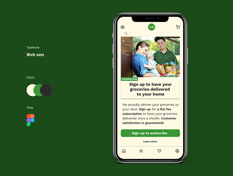
Scenario: A user is in their favorite supermarket. They open the supermarket’s app on their phone to see what’s on sale and are greeted by a promotion. Challenge: Write a promotional home screen for a subscription service that delivers groceries to the user once-a-month for a flat fee.
Headline: 45 characters max Body: 175 characters max Button(s): 25 characters max
Design approach: To promote the subscription, I have tried to tell the intuitive message of what the service is about, what the customer needs to do to receive the service and what the customer may experience using the service. The photo image of the groceries being delivered is also a strong marketing tool that targets a key potential customer – a busy mom with an infant who needs a hand with her daily chores. This image allows the users to clearly understand the service provided by the subscription.
Note: I'd like to hear your feedback to improve my approach to the design and thought process. Thank you for your time and comments in advance.
