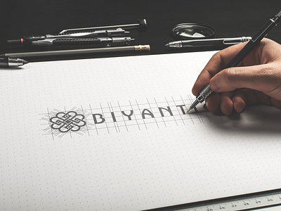
Biyantie Branding Design
Biyantie is visualized iconically using ornamental approach. The four B alphabets represent four brand values of Biyantie which are feminine, luxurious, eco-friendly, and sociopreneur. That shape is combined with other elements to visually looks more esthetic. The four B that are mutually connected to each other visualize a unity and symbolize emotional connection between Biyantie and its customers by brand values at once.
https://www.behance.net/gallery/87128713/Biyantie-Branding-Design
More by Arif Retenk View profile
Like
