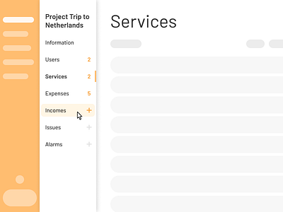
Side menu with two level navigation and quick actions
Hi Dribble!
I have made this menu for a tool for employees some time ago. The tool needed two levels of navigation and make the most of vertical screen space.
The solution shown here allows the user to navigate directly on two levels of navigation, to have basic information on the content of the sections (even if they are empty) and be able to add elements to them without having to navigate to the corresponding screen.
To save vertical space, the side menu was the best option to take advantage of horizontal space. To facilitate the efficiency of employees, it was important not to hide the actions and navigation of the different sections after a drop-down menu for example, but to have everything at sight. You have to be careful to show everything at sight to a user because it can be overwhelmed, but thinking through interactions, the design can end up being minimalist without problem.
It is a side menu whose first and second level navigation can be done with a single click, without hiding options. In addition, it provides information inside the pages, such as a counter of the number of elements it contains (if it exists, for example, in the Information tab there would be no number of elements). To increase the efficiency of workers, I proposed adding an action to add an item to the corresponding section without the user having to navigate to the section to add an item. In this way, with a hover, the available add actions would be displayed (since not all sections can have an add action, for example Information). By clicking on this action the user could add an item to the corresponding section. By clicking on the section title, the user will navigate to it.
Thanks so much and like it or comment if you found it useful!
