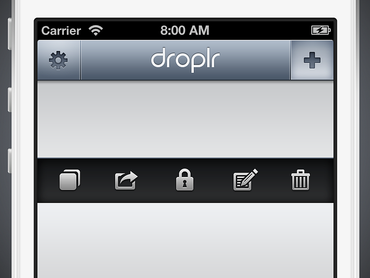
Droplr iPhone Adjustments
Been doing some cleanup on the UI elements for Droplr's iPhone app.
Re-rendered the logo using vector shapes instead of the font so it's cleaner and crisper. Next step is to perhaps try it with the marquee tool like Louie suggested here.
Updated the navigation bar colors and style to remove gloss and more closely fit in with iOS6.
Finally, redid and added some action icons in preparation for a more comprehensive iOS6 update. @Philipp Antoni will recognize my problem with one of these haha: http://d.pr/i/bx7y
More by Joshua Bryant View profile
Like
