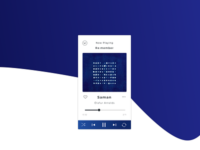
Daily UI 009 Music Player
When I started to think how many actions I perform with my music app, I was surprised by how many there were. I tried to add as many as possible in the beginning, but the UI looked so cluttered. In the end, I just kept the minimum in the player / listening experience itself, and thought that most of the options would appear when you are navigating.
More by Lorena Lorenzana View profile
Like
