Experience Mobile App UI/UX Design
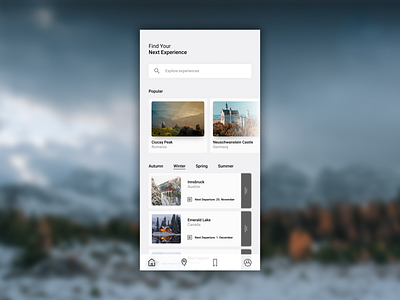
In this travel app, I'm trying to make the navigation intuitive, without too many explicit written directions.
The bottom navigation icons each have a slight drop shadow to make them stand out, and a darker and larger drop shadow for the icon that corresponds to the current page.
What do you think? Don't forget to like and leave a comment.
👉 Follow me on Dribbble
Experience Mobile App UI UX Design.png
2 MB