Simon Pan Finished Logo


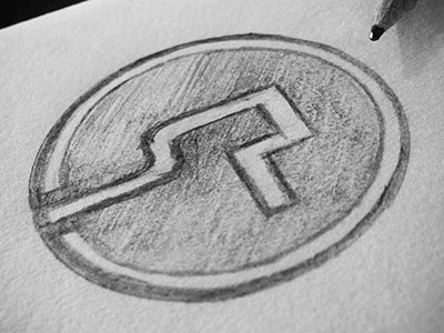
The visualisation of the ‘S’ represents the fluid, organic and flexible aspects of User Experience thinking, design and process. The visualisation of the ‘P’ represents the concrete and rigid aspects of User Experience research and evaluation. These are fused together into a Monogram style to communicate their equal importance in the nature of UX work. They exist in perfect harmony and strive to reflect my idealist design sensibilities for logic and emotion.