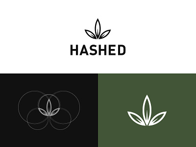
Hashed Logo Design
ABOUT THE CLIENT
Hashed is a cannabis company based in Vancouver, BC. They provide premium cannabis products.
CHALLENGE
The goal of this project was to create a modern and memorable identity that didn’t follow the status quo of using the cliche cannabis representation.
SOLUTION
To achieve this goal I created a simple logo design that is easily recognizable which allows the logo to be memorable. While the Hashed cannabis logo uses a leaf symbol, it’s clean, simple, and fresh-looking — not as literal or cliche as other cannabis leaf logos. With a modern all caps wordmark and a stacked layout that gives plenty of attention to the leaf-inspired symbol, this logo is unified and versatile. A well-designed package is essential in the cannabis industry, as it needs to communicate the product offering, as well as details like size, strain, and characteristics. The Hashed packaging uses a clean, sans-serif typeface to match the logo style, ensuring that all the information is legible while giving clear visual hierarchy to elements that are more important (product size and type). All the products have a similar design, but each kind of strain is a different colour. The different colours allow customers to identify the different cannabis strains easily.
To see the whole project click the link below:
https://kaejonmisuraca.com/hashed

