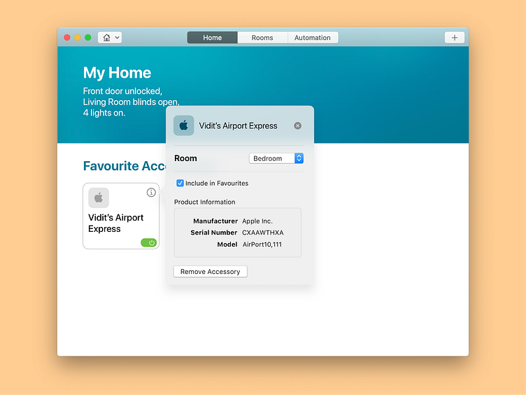
macOS Home App Redesign Concept (I)
A redesign concept for macOS Catalina's Home App which looks a lot like an iPad app right now. This redesign address two pain points with the current app:
1. The current app uses iOS controls and paradigms to layout content, and present them with a custom animation. The picker controls feel awkward to use on macOS because they aren't designed for point and click. This new layout however uses standard macOS pickers and offers a layout that feels much more native to OS making it easier to view and act on the information.
2. Currently, to turn a device on and off, you need to click the big square. Tapping big squares is fun, but it's no fun to click them with a mouse, it slows you down. So, a small power button has been added to ease that bit.
Reconsidering the use of colorful backgrounds. While they do add a playful demeanor unlike other apps which look a little bland in white, colorful backgrounds have a problem in terms of legibility, and so in this prototype the background is only restricted to the summary section of the home tab.
