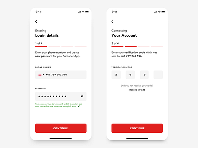
Santander App redesign concept- Login process 1/2
Hello guys,
After great feedback I got from you for my earlier project I am excited to present you another redesign concept from me. I am talking about Santander Bank App that I use everyday and I am not big fan of either visual aspects and also some UX solutions. I am aware that there are many surveys behind experience decisions but as it is my concept I allowed myself to make some changes.
Main goal was to keep everything clean and transparent so user always knows where he is and what he is doing, specially when there are many older and nontechnical users. I tried to convey brand colour as much as it is possible without being too obtrusive.
More is coming!
More by Bartek Gadzina View profile
Like


