NBA Finals Concept Redesign
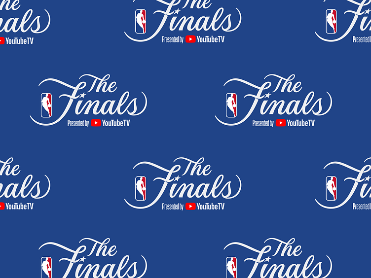
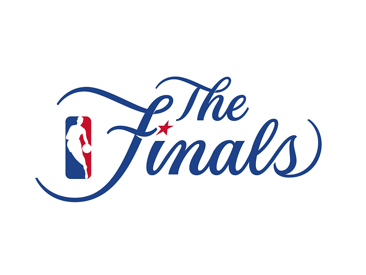


In 2018, the NBA decided to move away from the iconic script logo they’ve used for The Finals since the 80’s and replaced it with a bland (imo), advertiser-friendly design. So it was the perfect opportunity for me fix some of the inconsistencies I saw in the old logo, but keep what I think gave it its charm (oversized F, the swash on the s, the star, etc.).
In 2018, the NBA decided to move away from the iconic script logo they’ve used for The Finals since the 80’s and replaced it with a bland (imo), advertiser-friendly design. So it was the perfect opportunity for me fix some of the inconsistencies I saw in the old logo, but keep what I think gave it its charm (oversized F, the swash on the s, the star, etc.).
In 2018, the NBA decided to move away from the iconic script logo they’ve used for The Finals since the 80’s and replaced it with a bland (imo), advertiser-friendly design. So it was the perfect opportunity for me fix some of the inconsistencies I saw in the old logo, but keep what I think gave it its charm (oversized F, the swash on the s, the star, etc.).