Magazine Layout
Hey guys,
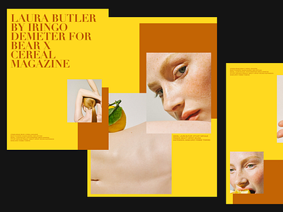
combining warm colors and nice photography I made an example for a magazine layout, also using contrast typography and a lot of white space.
Tell me what you think :)
More by Andrea Jelić View profile
Like
