Aurora Cultural Centre
Introduction
Aurora Cultural Center is a community organization and registered charity located in Aurora, Ontario, that believes art, culture, and heritage play an important role in our lives - creating a compassionate society through shared experiences. Founded in 2010, the Centre is located in a historic schoolhouse built in 1886, which serves as a memorable and tangible piece of Aurora’s personality. With core full-time staff and a host of volunteers – including a board of directors – the Centre offers a host of services including four gallery exhibition spaces, a range of instructional classes for all ages and interests, a live music auditorium, and other rental spaces designed to serve the community.
The Ask
When it came to presenting the Centre's brand in tandem with its many sub-brands, a real challenge became apparent. Repeating events such as the Great Artist Music Series hosted by The Centre often require a separate personality and tone that would dilute or inaccurately represent The Centre's core brand, resulting in a weaker brand experience being delivered to the Centre's various audiences.
The Centre had also long been associated with the schoolhouse that serves as the organization’s base of operations, given that the building has a lot of character and history within the community. However, the team was required to move out of the building for a substantial amount of time, resulting in a major piece of their identity being lost.
Finally, the staff at Aurora were somewhat worried about moving their design production out-of-house. Staff had invested significant time and care into the production of the brand thus far, making their team weary of who they could trust to understand and capture their vision moving forward.
The Solution
As part of the discovery and planning process, Weight Creative felt it important to meet the team on-site in Aurora, Ontario and devoted a significant amount of time towards understanding the history, culture, and vision of The Centre before attempting to tackle any strategic branding or creative work.
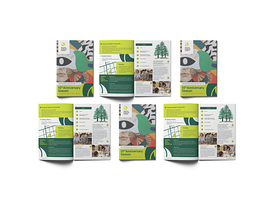
The Centre underwent a thoughtful visual refresh with new typography and a revitalized color scheme featuring designated secondary colors for key sub-brands that had been identified during discovery and planning along with a set of custom icons to help with way-finding. A robust visual system guidelines document was also created to allow all tiers of staff (design-related and otherwise) to create cohesively branded materials that would communicate the brand’s voice and characteristics effectively on behalf of The Centre.
Finally, since the brick and mortar schoolhouse would no longer always serve as a major touch-point for the brand, the focus was shifted towards community, creativity, and skills development: showcasing the diverse offerings the Centre provides rather than the Centre as an entity itself.
Results
Aurora has the peace of mind knowing they have secured a long-term graphic design partnership with a vendor that understands their audience, visual strategy, and core values. The brand has been strengthened to better engage their target audience with systems and documentation in place so that more staff can interact with it cohesively. Collateral communicates relevant sub-brands while maintaining a consistent look and feel that is recognizably The Centre’s own, effectively building better brand recognition and increasing engagement for events and registrations.
