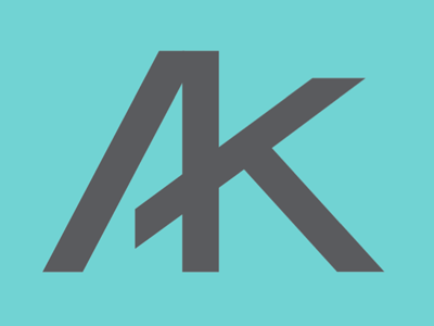
K plus A
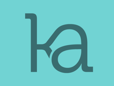
Client decided on K+A instead of A+K. I like the A+K version better, but this is the direction we're moving forward with. The link between the K and A needs a little polish still.
The stem of the K was dropped lower than normal. Does it make the lowercase A look gigantic? or is it just me?