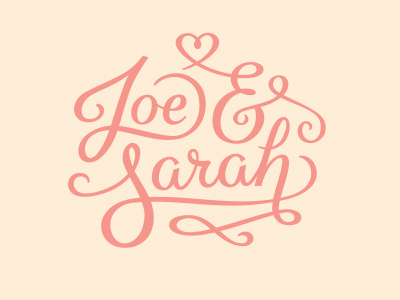
Joe & Sarah v2
Final version (possibly..), suggestions welcome. Especially to do with the variation in weight of stroke - I've tried to keep the caps and ampersand slightly thicker, the lowercase downstrokes next thickest followed by the swashes. Swashes coming off the 'h' and ampersand crossbar feel a little awkward.... Feedback definitely needed!
More by Matt Redway View profile
Like
