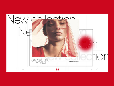
H&M home page
This is my new H&M home page design.
I think that the site of a modern clothing store should be unusual and attracting attention. Now the h&M website looks very simple, while having quite an interesting collection of clothes.
I'd be very grateful to hear your feedback 🙂
More by Daniel Nefedov View profile
Like


