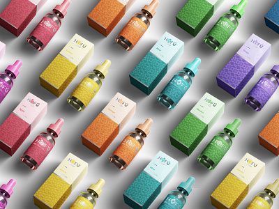
HOFU Fruit Edition E-Liquid Packaging
The inspiration comes from the flavor of smooth, transcendent fruit with a velvety, sweet finish of fruit slice.
HOFU explored the geometric style in a unique and fun way , bringing a linear movement to the packaging . The image of fruit slice is styled into symbols then rearrange to create an playful pattern putting on packaging and all other materials of HOFU.
We use bright, colorful, bold and eye-catching color to enhance the attraction of customer from anywhere or any angles. The explosion of colors turns the packaging into something very special and cool. To see more, please visit https://www.behance.net/gallery/86910509/HOFU-Visual-Identity-Packing-Design
More by Franke View profile
Like
