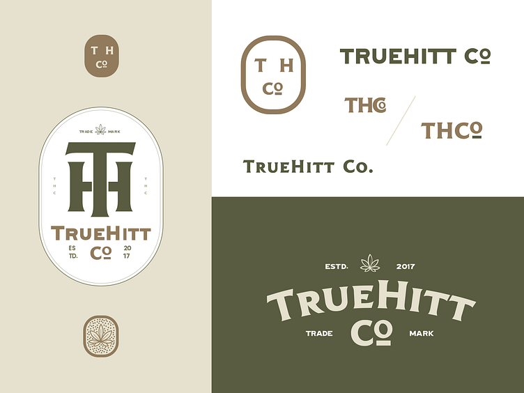
Truehitt logo
Here is a look at the expanded Identity for Truehitt. They had a seal similar to the TH on the left, but we refined it to meet their current needs. Even though this wasn't the final color chosen for the project I found it to be a very calming combination that helps to further instill the idea of the brand.
More by Raul Flores View profile
Like

