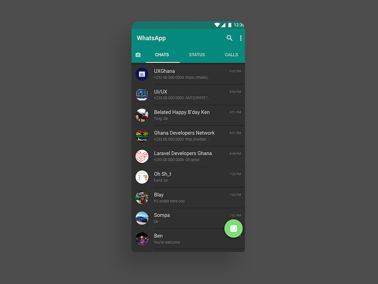
Whatsapp dark mode
The design process was actually to learn not necessarily solve a problem with the existing WhatsApp chat screen.
What I noted: 1. Alignments of contents - (Made much use of grids while implementing the design) 2. Took note of font consistency and rhythm. 3. How font sizes and colors/shades are used to emphasize content and guide users. 4. How the WhatsApp app uses white space in grouping and separating components. (Closer elements seem to be a group).
With a dark mode, I had to consider point 3 and to maintain the same user experience
More by Yoofi Graham View profile
Like
