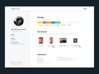
iCloud — Web Settings redesign
Once in a while I catch myself using the iCloud for the web and I noticed how bad it is on the Settings screen, so I decided to do a slight redesign of this screen.
I think that keeping the main content on a left sidebar would allow us to easily manage the account and also avoid unnecessary scrolling.
More by Haran Amorim View profile
Like
